

Visit Site
Featured On

Y

Y
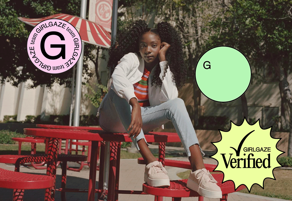
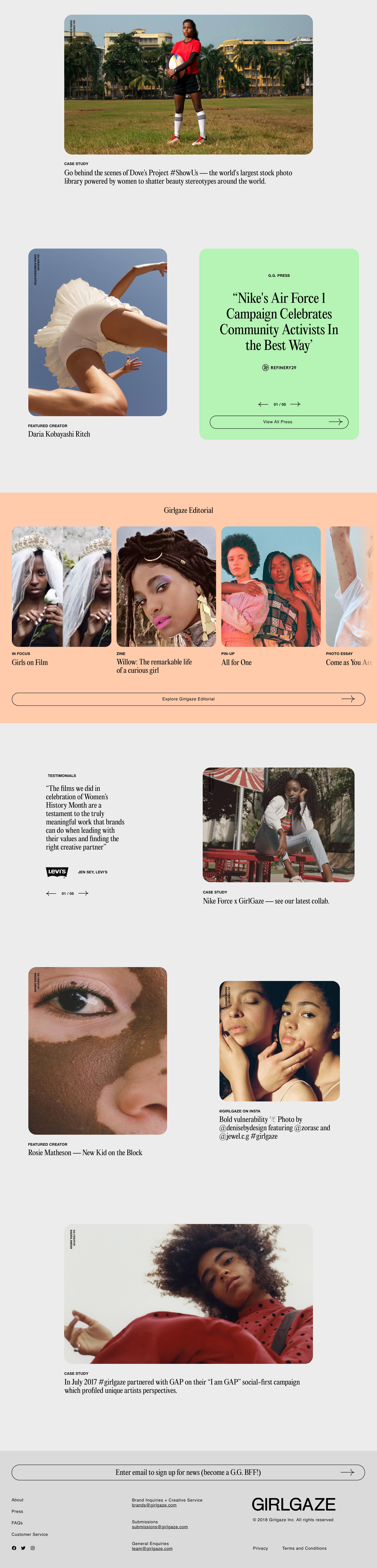
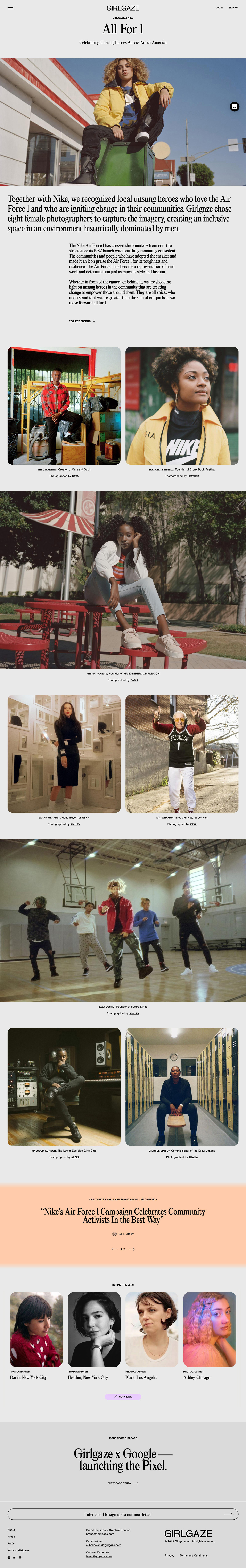
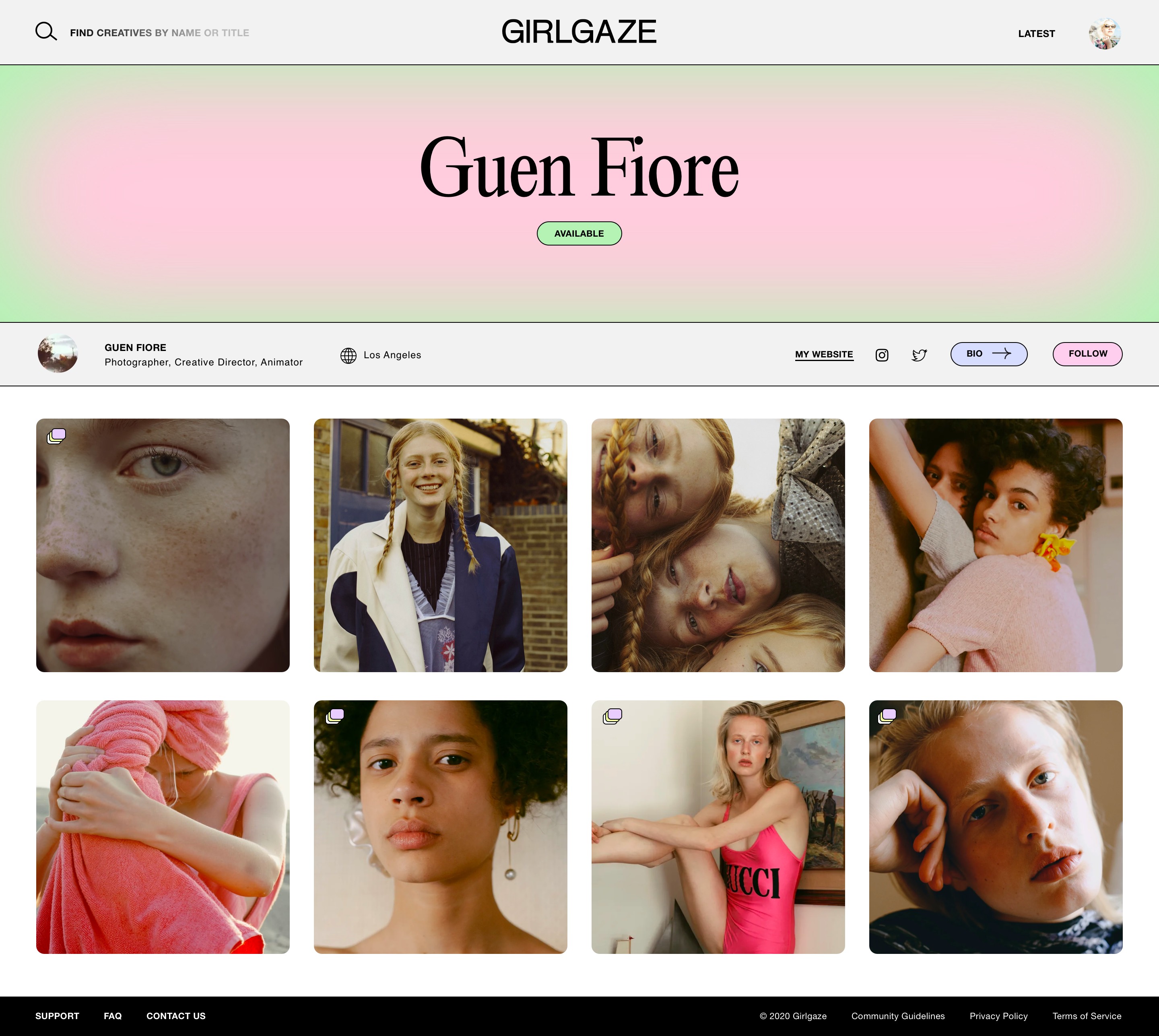
Evocative of the buzzy energy behind the organization, yet neutral enough to act as a home to content from all walks of life, the identity exudes a quiet confidence, with an element of delight.

Y
Y
Website
Y
Y
Y
Y
Y

Y
Y
Y
Y
Y