Visit Site
Featured On

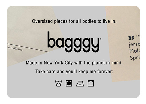
Logo & Tagline
Y

Y
Typography & Color
Y


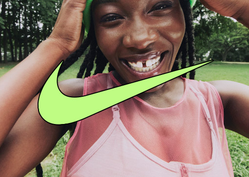
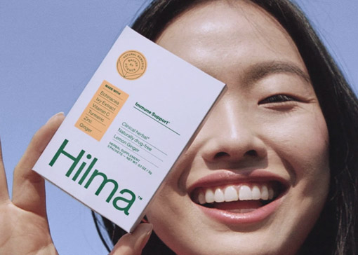
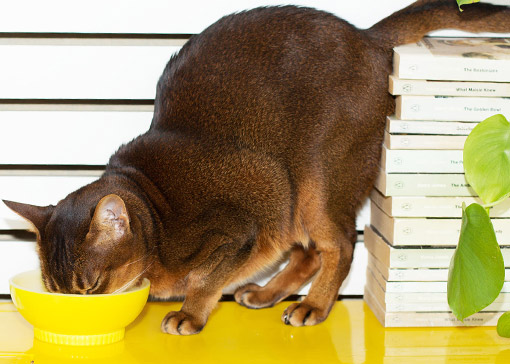
Art Direction — Lifestyle
Y
Y
Y

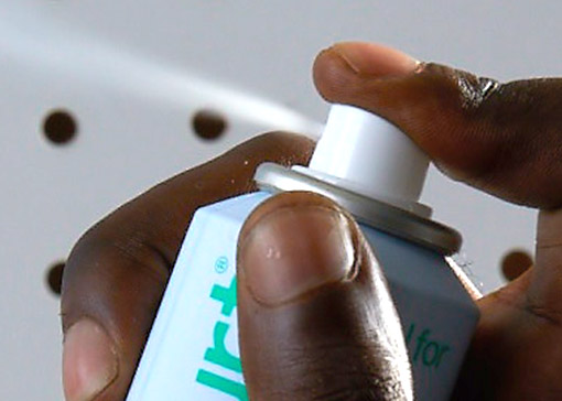
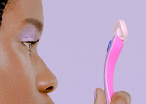
Art Direction — Product
Y

Y


Y
Y
Y
Y

Y

Y
Y


Y


Y
Y
Y
Y
Y
Website
Y


Y
Iconography

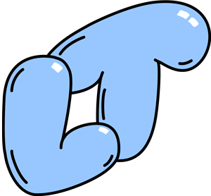
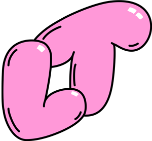
Illustration